Student Failure Process
Visualizing the student failure process
For this project, our team worked with the Assistant Dean of Academic Affairs to help learners better understand what happens if they fail a major assessment in medical school.
The Challenge
In medical school, learners are frequently assessed through written exams. Although challenging, these major assessments are critical to medical student's education as it ensures the level of competency needed to become a physician. For this reason, the Faculty has a formal process to help students that fail one or several major assessments throughout the year. To keep students on track, the faculty offers rewrites, has a review committee, makes recommendations, and allows an appeal process. In the past, these processes were only communicated through text-heavy policy documents, leaving learners confused about the process. For this project, we worked to demystify this complicated process and aimed to clarify the faculty's intentions behind their assessment failure process.
What We Did
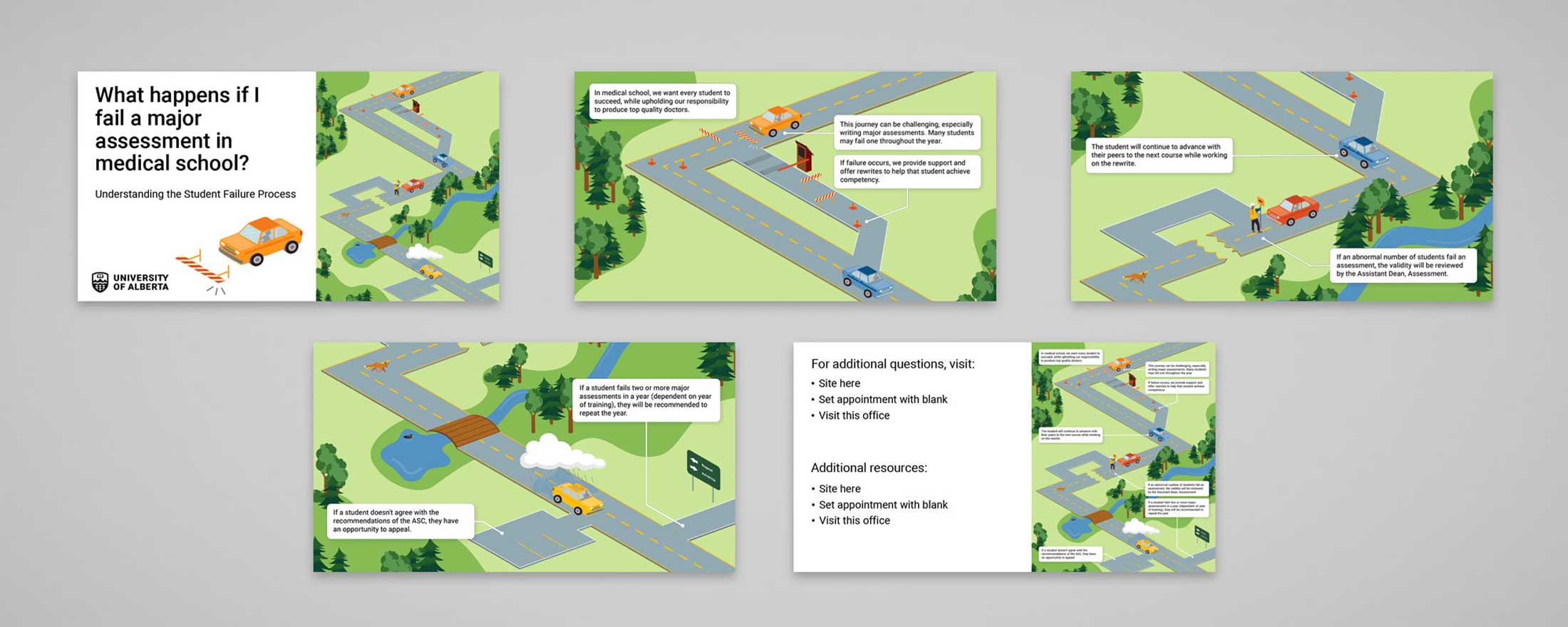
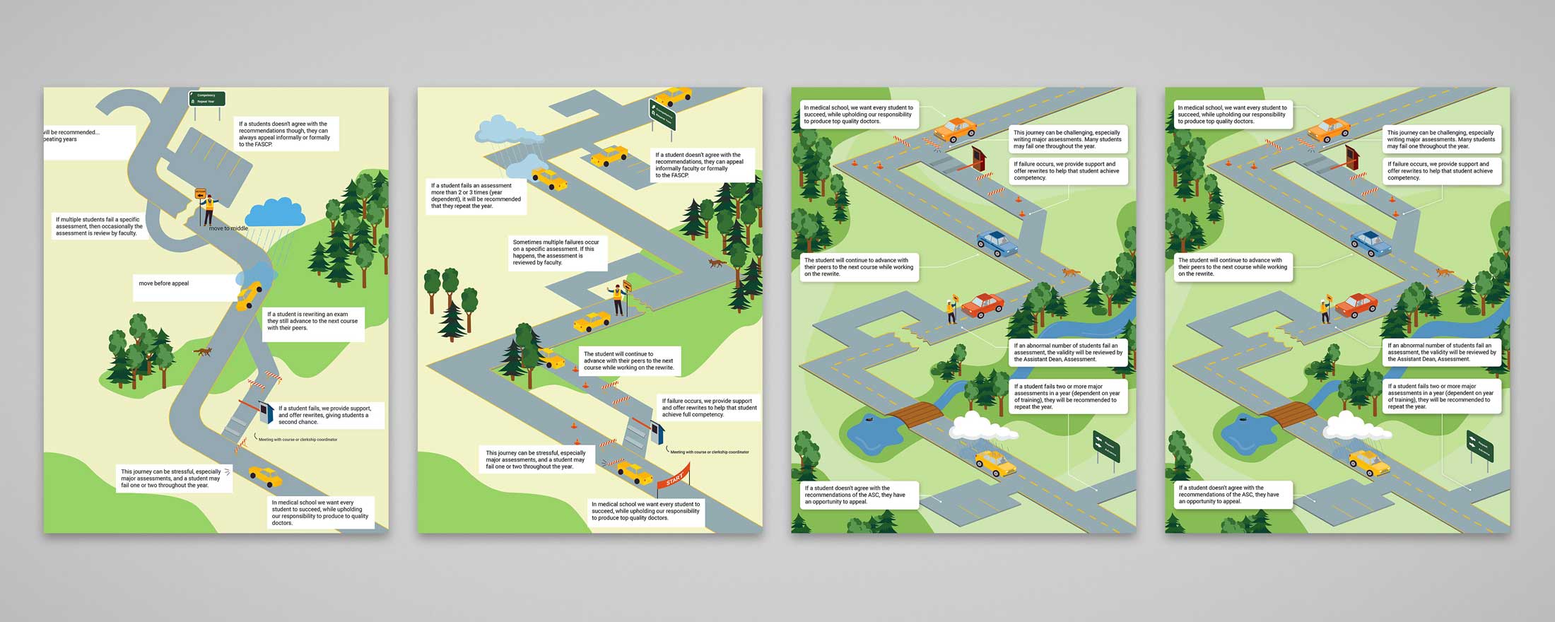
Our final deliverable for this project is an infographic and set of slides. This approach uses visual metaphors, select text, and illustration to breakdown the steps of the student failure process. This infographic can be distributed digitally or printed, and has been expanded to include slides for student orientation.

Ideation and Exploration
To gain a complete understanding of the process we read all policy documents and spoke in depth with the Assistant Dean, Academic Affairs. From this point, we narrowed down the key points the learners and staff needed to understand and began to ideate how to best visually represent this process.

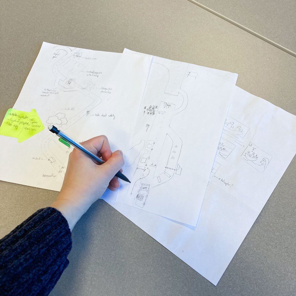
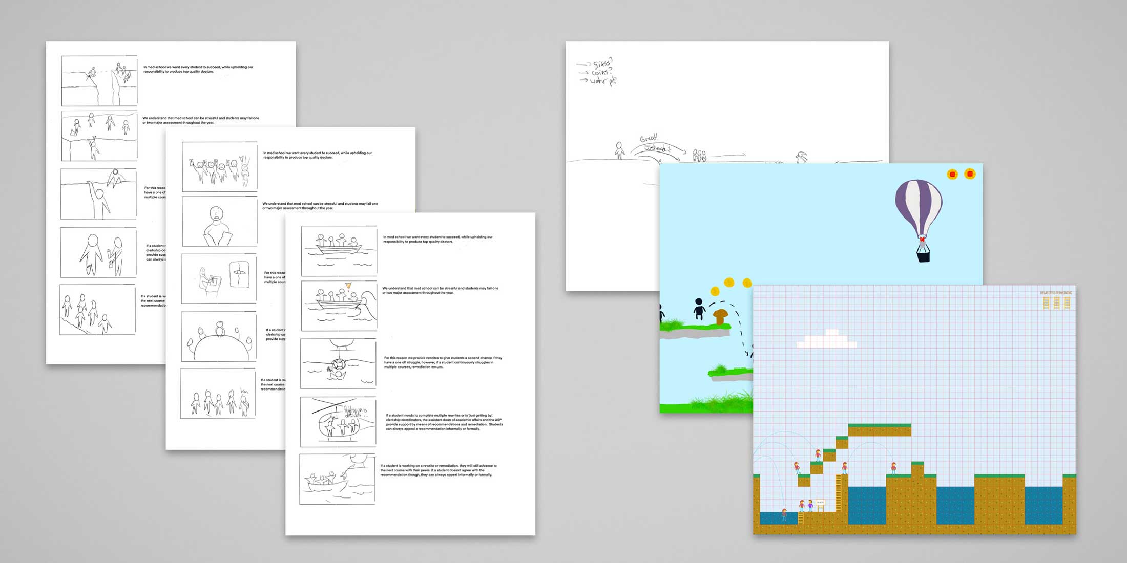
Through a series of sketching and story boarding we discovered that a narrative or sequential approach would work best to represent the time and stages that happen once a student fails a major assessment in medical school. Ideas were narrowed down to two possible visualizations, and eventually we decided to pursue a road-map visual.
Our Rationale
We chose to illustrate a road map because it aligned with the faculty's ideology for the student failure process. For example, all learners will be on their own academic journey, will run into obstacles and road blocks, and may need to take a detour. With the help of the formal student failure process, the learners will get "back on track" and advance with their peers. Once the learners reach the end of the year, the review committee may ask them to repeat the year if they have failed more than 2 major assessments. This is highlighted as the cars reach the end of the road and have three options: repeating the journey, parking and appealing their recommendation, or continuing onwards.
At the highest level, this infograph draws parallels to road safety and the formal failure process; driving has rules and safety measures to keep everyone on the road safe, just like the Faculty has rules and a formal process to ensure that the medical students graduate with full competency.
The Details

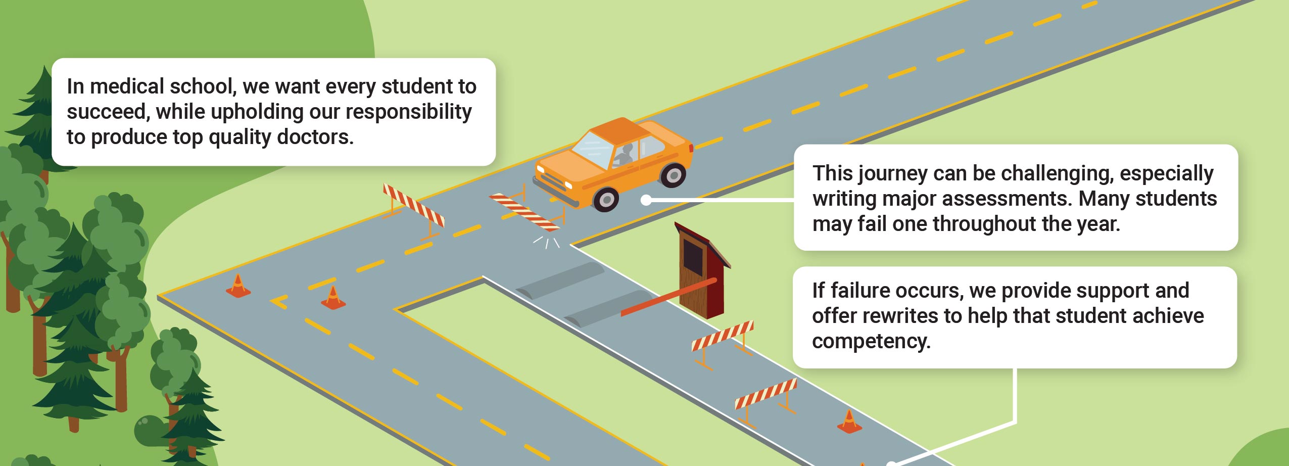
The infographic shows a road. At the beginning of the graphic, the text reads: In medical school, we want every student to succeed, while upholding our responsibility to produce top quality doctors.
There is a car waiting in front of a traffic barrier that has been broken by the car running into it. Text pointing to that area reads: This journey can be challenging, especially writing major assessments. Many students may fail one throughout the year.
Past a toll booth with the arm down, there is a turn-off in the road with various traffic barriers and cones. The text pointing to this turn-off reads: If failure occurs, we provide support and offer rewrites to help that student achieve competency.
Further along the main road is another car moving along smoothly. The text pointing to that car reads: The student will continue to advance with their peers to the next course while working on the rewrite.
Further along the road is a car stopped by a construction worker before it hits the cracked portion of the road. There is a detour to go around the crack. The text pointing to the construction worker reads: If an abnormal number of students fail an assessment, the validity will be reviewed by the Assistant Dean, Assessment.
There is a fox crossing the road at the corner, then a bridge over a river. Following the bridge is a final car with a cloud and rain over it. Just beside this car is a parking lot, and ahead seems to be open road and a turn-off with a sign reading Repeat (with an arrow back), and Advance (with an arrow forward). The text pointing to the turn-off reads: If a student fails two or more major assessments in a year (dependent on year of training), they will be recommended to repeat the year.
The text pointing to the parking lot reads: If a student doesn't agree with the recommendations of the ASC, they have an opportunity to appeal.
What We Learned
By creating a visual aid to help communicate a complicated process we were again reminded that through effective graphic and information design complex processes can be broken down. Additionally, by prioritizing the targeted audience we learned that not all the information provided to us needed to be displayed on the infograph. This streamlines the information and highlights the important messaging.
Do you have an idea that you want to work through?