Cascade Layout Templates
The migration to Cascade as the new CMS for the University was done, in part, to provide an easy to use content management system that helps site owners build pages and websites with little to no knowledge of code.
Though Cascade is easy to use, you will require a little knowledge and some helpful terminology to help you get started. The Cascade interface is mostly point-and-click and once you get the fundamental workflow, you will be able to create and edit the layout of any page on your site.
Core Concepts & Terms
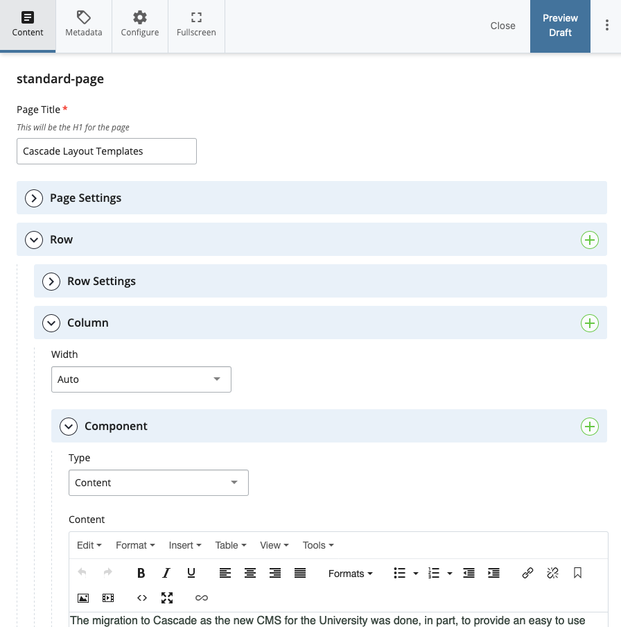
You can build the layout of a page in Cascade by clicking on the Edit button and scrolling down to the section titled Row. You will see in the editing interface that there are sections titled Row, Column, and Component. You should also take note that these items are nested inside of each other. You can place multiple Components inside of a Column. And you can place multiple Columns inside of a Row. Understanding this hierarchy is important when building your own page layouts or even copying ones that already exist.

This image is an example of the Editing interface in Cascade
How do they work?
You can see from the image above that each Row, Column, and Component, has a green Plus sign button. If you click on these buttons you can add more of these sections to the page. Each section will behave differently in the layout you’re editing and it is important to understand why they work the way they do.
Rows
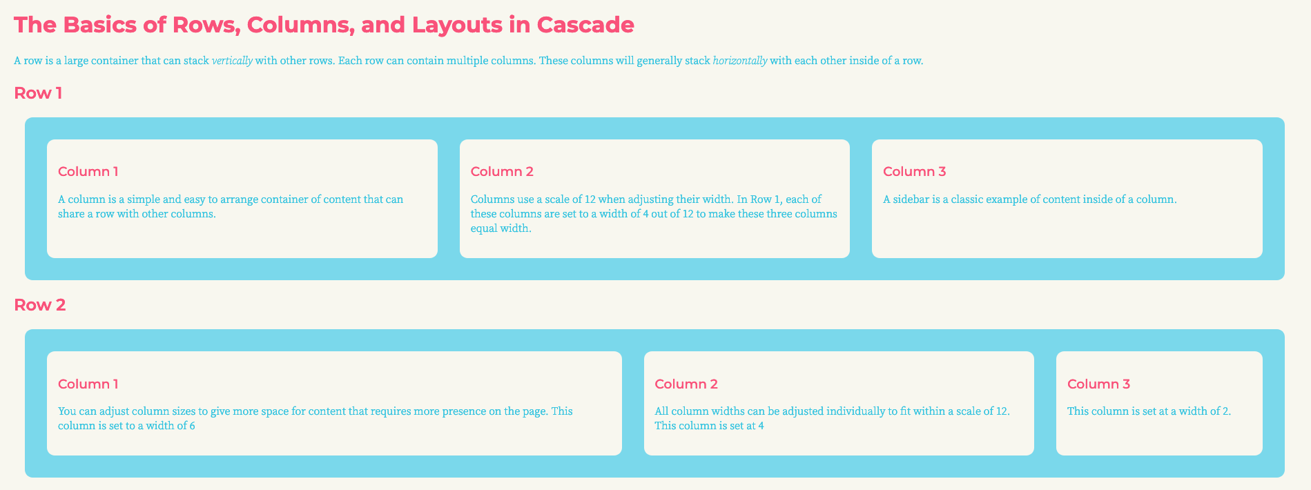
The row is the largest container that can stack vertically with other rows. Each row can contain one or multiple columns.

In this image, you can see two rows (the containers in blue) that stack on top of each other. Inside each row, you can add multiple columns to further break up the space within a row and achieve the desired layout.
Columns
You can place one or multiple columns inside of a row and set the width of these columns with a field that appears just below the column in the Cascade Edit interface. These columns use a scale of 12 because it is an easy number to divide into different ratios. If you want to a two-column layout sitting inside of a single row then you would add two columns and set both of their widths to 6.
A three-column layout would require three columns with each set to a width of 4. You can also create more offset layouts with three columns set at 5, 4, and 3 to create two content columns and one sidebar. If you can divide 12 into different combinations, you can set these up for your page layout.

This is an example of the width setting for a column in Cascade.
Components
Components are the smallest piece of the puzzle when building layouts, but they are very powerful. Components live within columns and can be stacked vertically inside of a column. As an example, a sidebar may have three sections of content each represented by a component. The sidebar itself is just a smaller column (usually with the width set to 3) with three components inside.
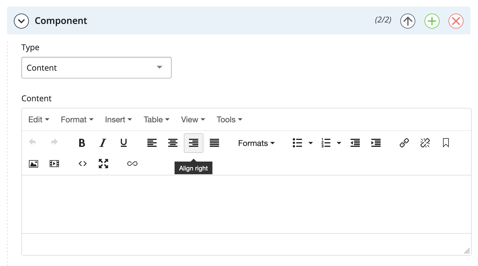
But what are components and what do they do? A component is a pre-made, pre-programmed section that allows you to easily build content and place it somewhere inside of a column. The most basic example is the Content component. If you create one of these, it gives you a basic text editor option that lets you place and edit any written content you have created for your page. There are many other components that provide a good variety of useful features, such as news feeds that pull in news posts, twitter feed components, and image carousels to create image sliders to name just a few. These components let you customize your site and content without having to learn or use code.

The Content component that provides a simple text editor.
Left Hand Navigation
You will notice on this page and the other example pages that the left-hand side has a sort of "sub-navigation" menu. This menu is completely optional and you can turn it off in Cascade by going to Edit > Page Settings > Navigation and then unchecking the "Show Left Navigation" box:

Useful Resources
We have also created a Wowbook that contains a number of code snippets you can use to further customize your content. You can find the Wowbook here. Each of these snippets can be added to the Content component by using the HTML Editor.