UAM Summer Internship 2018: How to Avoid Twiddling Your Thumbs
Martin Bierens - 2 August 2018
On the odd occasion when I do get a bit of a break from my busy schedule at the University of Alberta Museums, I try to not spend my time twiddling my thumbs waiting for the day to end. One suggestion I received from Associate Director Frannie Blondheim was to become more knowledgeable in the field of museum studies, or museology. Lucky for me there is a large number of resources on museum studies that I can access. There is a large variety of topics ranging from theory, collecting, conservation, exhibits, and many more.
What I have been interested in particular, is literature on exhibition design and planning. Within the next month at the University of Alberta Museums, we will be opening two new exhibitions. The first is opening on August 20th, Mountains and Water: Visions of the Land in Canada and China. This exhibit features work by prominent Chinese and Canadian artists, from the University of Alberta Art Collection and the Mactaggart Art Collection. This exhibit celebrates the opening of a new center for the China Institute at the University of Alberta.

The second is a collaboration with the Wirth Institute for Austrian and Central European Studies. Forgotten Fronts: The Austro-Hungarian Army in the Great War, focuses on Austro-Hungarian artifacts from World War I and is commemorating the twentieth anniversary of the opening of the Wirth Institute, and the 100th anniversary of the end of World War I. This exhibition will be located in the Old Arts Building. Through reading various books and articles on the topic I have become more appreciative of all the work that goes into planning an exhibit. This can include simple decisions such as what type of font to use for the exhibit title, to lighting, to flow patterns of visitors. All of these are important and to be taken into consideration. They will affect the experience of the visitor and the effectiveness of the exhibition.
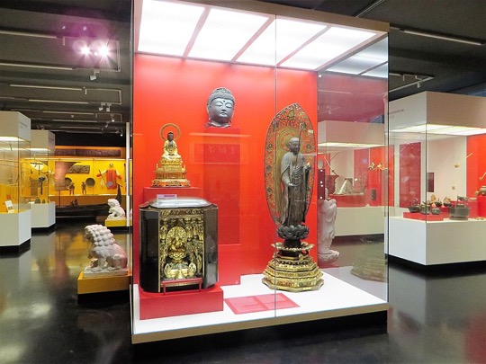
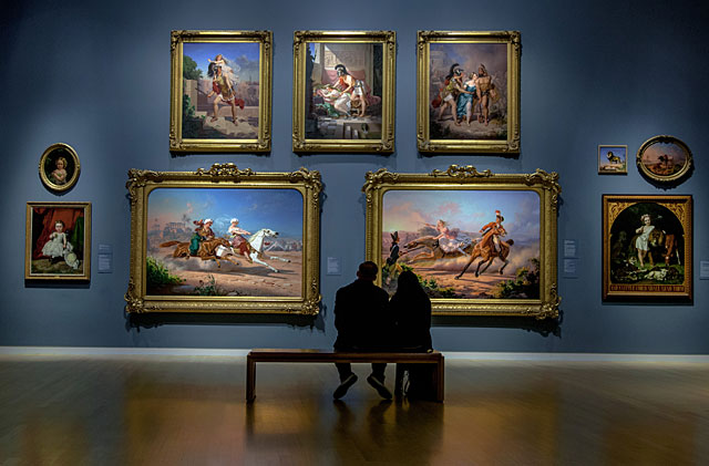
One very interesting thing which I learned, is how colours can drastically affect the visitors' experience of the exhibition. In rooms where it is encouraged that visitors are excited and active the walls will often be painted a warm colour such as red. This is because warm colours stimulate the brain and will make those viewing the exhibit more energetic and active. Vice versa for cool colours like blue. Cool colours relax the brain and lead to subdued and relaxed atmospheres. Art galleries may often paint their walls dark blue in order to create a peaceful, quiet, and relaxing atmosphere in the room which translates to the guests. Next time you visit a museum I encourage you to take note of the colour scheme of the room and how it makes you feel while in the space.
 Google Images, public domain
Being able to have the time to read some of this material while I am getting hands-on experience with what I am reading about is very beneficial. I am able to see some of the process and planning steps which are outlined in the literature and which I had to opportunity to take part in, as I drafted a tentative schedule preparing for the Forgotten Fronts exhibit. This will be a great asset to me in the future when one day I head to grad school for museum studies. I will have a jump start on some of the concepts and practices which I will be learning about.
I am sure that I will soon be losing the luxury of having downtime to do some of this reading when our exhibition development goes into full swing. We will soon begin to install the exhibits and then after the official opening of the exhibit, I will once again be a gallery docent for Mountains and Water. But, while it lasts I will take every opportunity to become more knowledgeable in the museum studies field to hopefully have some useful input here at the University of Alberta Museums and to get a jump on my future at grad school.