Layout/Banners/Footer
Standard width = 600px
Maximum height = 1500 to 3000px
On this page:
As mobile email client use continues to grow, it’s critical to ensure your email layout is mobile-friendly.
- Scannable
- The average time spent reading an email is 10s, so it is important that the email is scannable. This can be done with the use of a header hierarchy as described above.
- Use white space
- Make sure to include adequate white space around the elements in your email. White space helps to separate the elements in your email, encouraging click throughs. It also helps to make your email more legible and easier for the reader to scan.
- Use single-column layout whenever possible
- Streamline content and reinforce hierarchy. Multi-column can lead to sensory overload but are good for newsletters or emails with multiple CTAs. They are also good for accessibility.
Most important information before the fold (350 - 500px depending on device). This will be what people see when they open your email, so you want to make sure key information is going here.
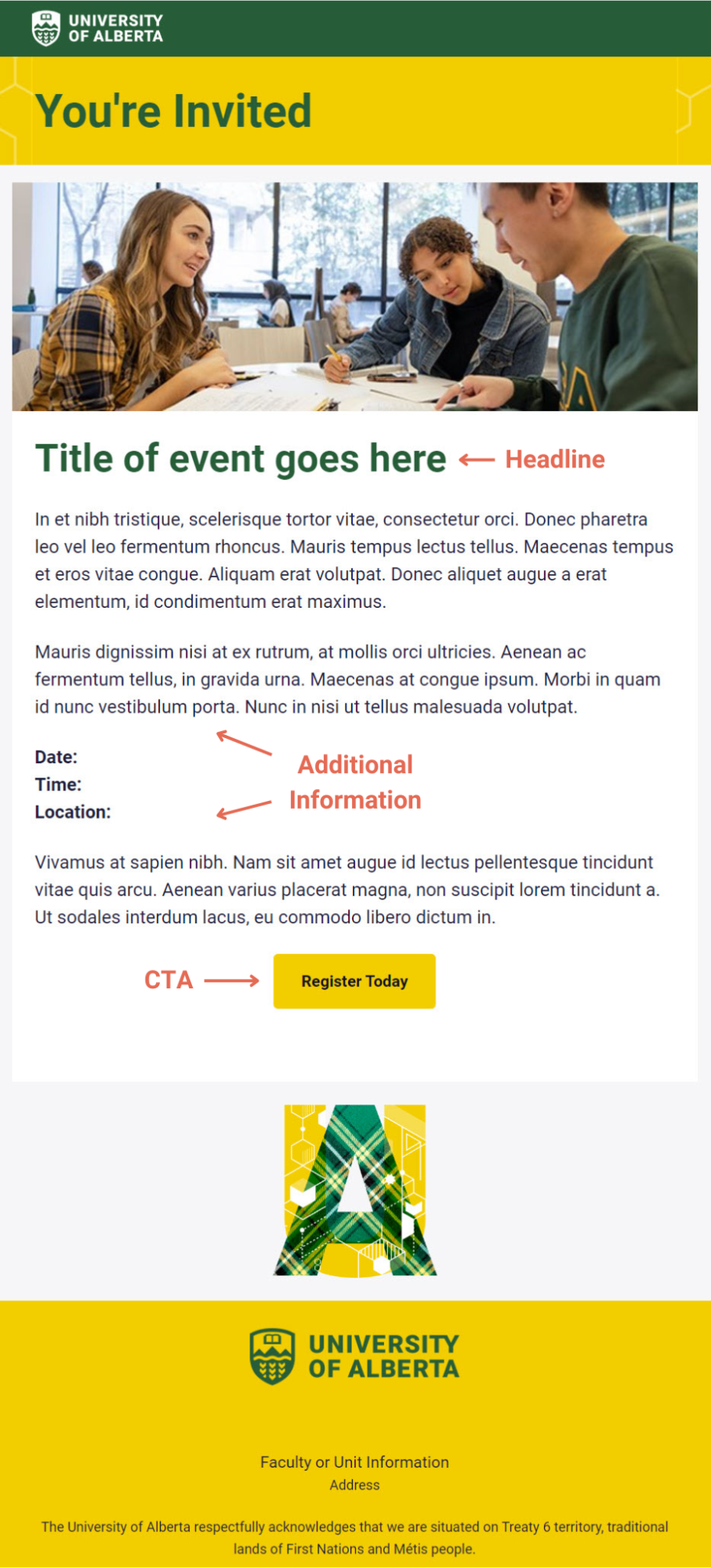
The most popular email design is the inverted pyramid. This involves an attention-grabbing headline, additional information, and then closing out with a CTA in the form of a button.

Lastly, identify any advertisements as an ‘Advertisement” within the email. If the email is commercial, (inclusion of advertorial material makes an email commercial in nature), make sure that you are compliant with CASL.
Banners
A banner is the space containing the University of Alberta logo and title at the top of your email. Email banners are an effective way to promote your campaigns, build brand awareness and increase recognition, as well as set the tone for the rest of your email. A good banner should let your reader know what to expect from your email.
There are a variety of email banners that are already built into the templates provided to you. These banners have been created to follow the university’s branding guidelines. These templates can be found under "Templates" in your settings menu as well as under the "use a template" option when designing your email campaign. Choose the banner that is most appropriate for your email.
There are two main designs: a primarily green design and a primarily yellow design, each with various different banner background designs options. We've provided you with each with the backgrounds built in so they are ready for you to use. The banner text is editable, allowing you to name the email whatever you’d like. There is also additional space to add an edition number or other text in subheading if you need it.
We've also provided each account with an Event Invitation template, one green and one yellow, since event invitations are some of our most frequently sent emails. Please feel free to use and adjust the other new templates for your events as well.
Footer
Footers are found at the bottom of your email. Footers are required to include the following:
- An unsubscribe link - Campaign Monitor automatically includes an unsubscribe link in your email to comply with many anti-spam laws and you cannot remove it. Mailist is the exception to the rule. Since we have implied consent with internal audiences, and Mailist only sends internal communications, you do not need to include an unsubscribe link.
- The U of A logo
- The name and the physical address of your Faculty or Unit. The University of Alberta address and name can also be used in place of the specific Faculty or Unit.
- Social media links. This helps with authenticity and to build up other channels as trusted sources of information.
CoE provided templates include a U of A logo in the footer along with a space for your address and social links. You can update the location and social account information for your specific unit. The footer also now includes a land acknowledgement. Footers also include a message to your audience about why they are receiving this specific email. Please update accordingly for your sends.